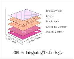
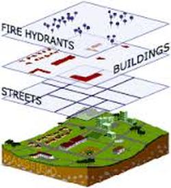
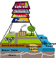
GIS/Maps provide a visual display of community demographics, school location, and existing infrastructure. Maps can be used to compare and contrast school locations, facilitate open discussion and find solutions for your community.
This map gives the viewer a visual display of median distance to school and includes percentage of students residing within a 1/2 mile radius of elementary school. For example, the median distance to Cottonwood School (far upper left) is over a mile (6,921ft ) and only 7% of students live within 1/2 mile (recommended distance to elementary school, EPA School Siting Guidelines), while at Broadwater School (far right and center) median distance is 1/3 mile (1,715ft) with 89% of the students residing within 1/2 mile of school. This map also shows the area from which the majority of students live within the school boundary (represented by thickness of the blue lines). An infrastructure layer shows major and minor streets as well as sidewalks (green lines represent existing sidewalk). An infrastructure layer of planned sidewalks with years and dates from the City Capital Improvement Plan (CIP) can be added. Existing and planned bikeways, signals, intersections and crosswalks help the viewer determine where infrastructure exists or will need to be improved to maximize safety for walking and biking to school. School Boundary areas can be compared and contrasted using GIS as well; calculate diversity and distance to school for each planning scenario.
|
|
|
Maps can be used to improve problem solving and merge interests. Collaborating across sectors and jurisdictions, can lead to more sustainable cost-effective decisions (EPA Collaborative-Problem Solving). Input from public housing, economic revitalization, public transportation, health and environmental organizations are critical to maximize use of public funds and create sustainable solutions.
Mapping demographic data provides a visual tool to contrast and compare financial, social, education, health and transportation implications of school location. Cities and schools that plan openly and collaboratively for development and re-development can save millions in taxpayer dollars.
Maps, graphs and tools:
Mapping data: (some examples provided below)
Maps, graphs and tools:
- Promote public participation and engage participants in the process
- Allow visualization of historical trends and patterns
- Help facilitate an open community debate/discussion
- Can be used to compare and contrast different scenarios
Mapping data: (some examples provided below)
- Historical student enrollment trends
- Community demographics - poverty, density, housing type, housing turnover, student yield by housing type etc.
- Infrastructure including sewer, water, sidewalks, bikeways, crosswalks and street lights (i.e. pedestrian friendly street design)
- Publicly and privately funded facilities: schools, libraries, gymnasiums, art, music, theater and science centers
- Public transportation
- ADA access
Questions for discussion: Are schools being opened or closed in neighborhoods based on income, student population, transportation costs or overall costs to community?
What is a desirable school boundary that maximizes access to school (self-transport), safety (infrastructure), and minimizes distance to school making it easier and more desirable to walk, bike or participate in before and after school activities?
What is a desirable school boundary that maximizes access to school (self-transport), safety (infrastructure), and minimizes distance to school making it easier and more desirable to walk, bike or participate in before and after school activities?
Youth Population Density Change
1990-2010
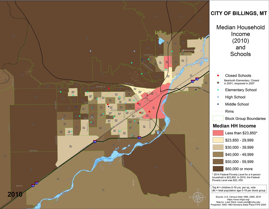
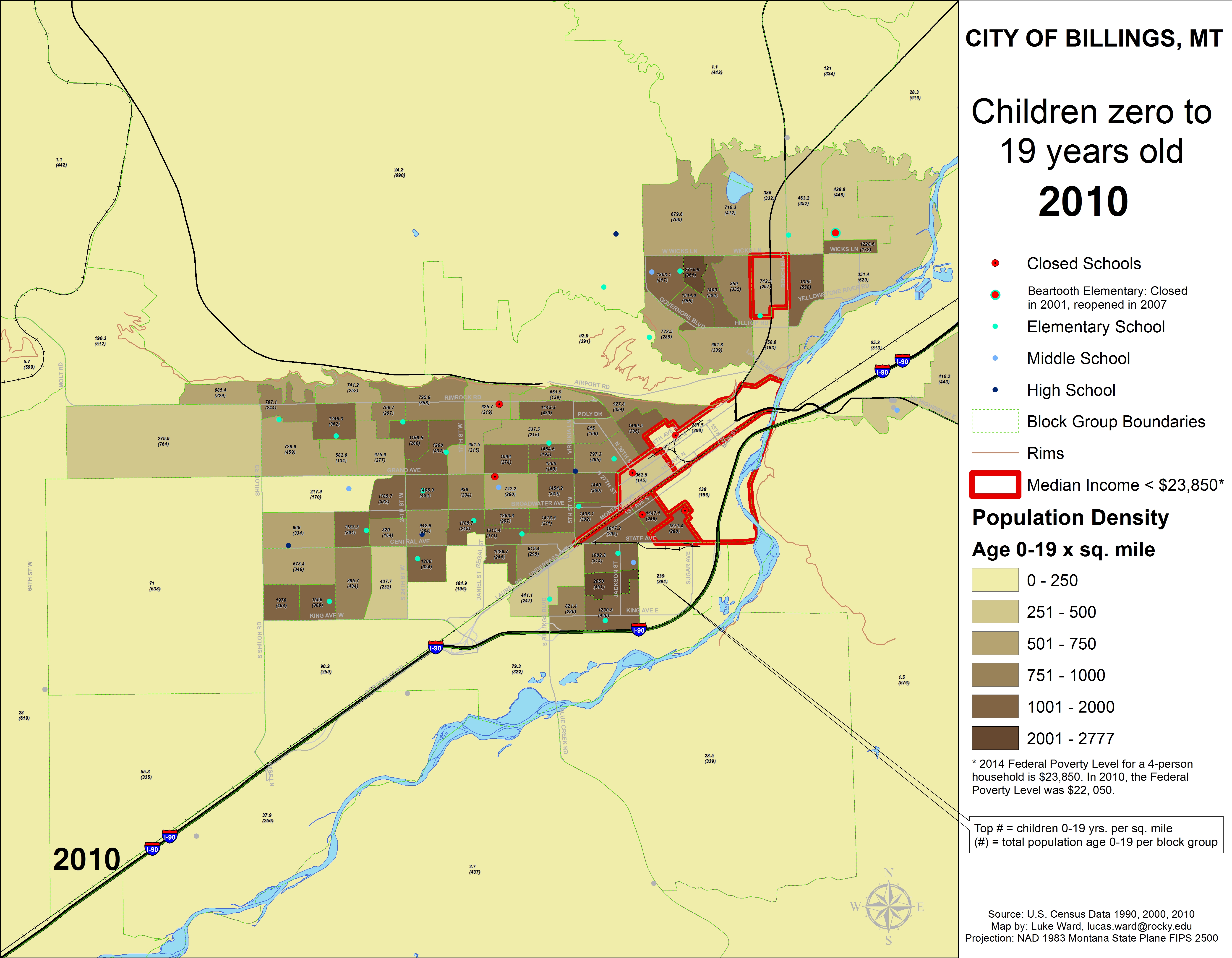
This map shows that the majority of school closures in Billings have been in neighborhoods at or near federal poverty level. The population density in these neighborhoods have historically been most densely populated with school-aged children. This income map is one example of how different data points can be overlaid (e.g. school closures/area income). In 2000, school-aged population density increased in the core of city; yet the area was again identified for school closure.
| Click for a Larger View of Median Household Income |
Homeless student population and location of temporary housing is another important factor that should be weighed in the school location decision. School location and transportation directly affect student access to before and after school programs. In Billings, the number of homeless students has increased annually; today more than 500 elementary aged students are homeless. The majority of temporary housing for the homeless population is located in the core of the city, near areas that have been affected by school closures. Because funding for education is enrollment based, the district managed dips in enrollment by closing schools.
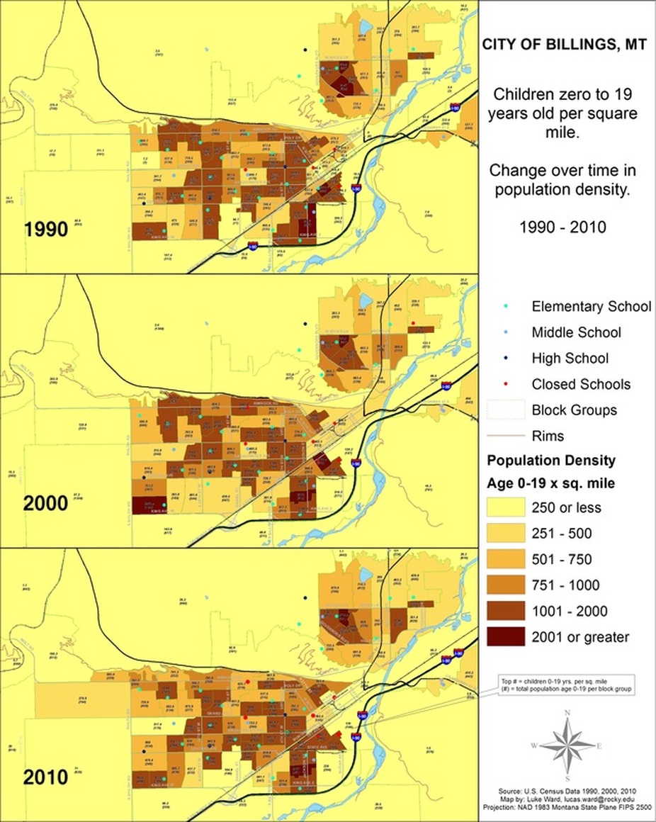
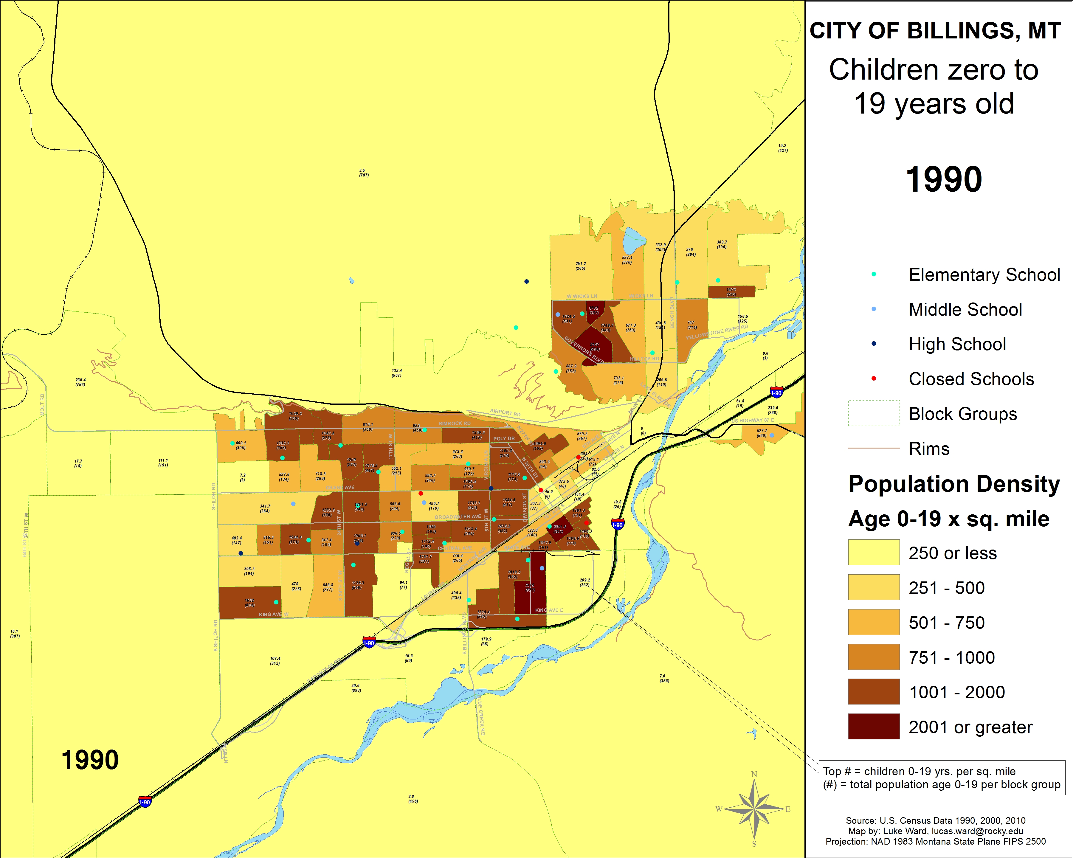
This map series below show 0-19 y/o population density over two decades. Elementary (K-6) school enrollment has increased and declined multiple times over decades.
| Click for a Larger View of Age 19 and under x sq. mi. (Population Density) |
Press "Play" on the map below to view changes over time.....
|
|
| ||||||
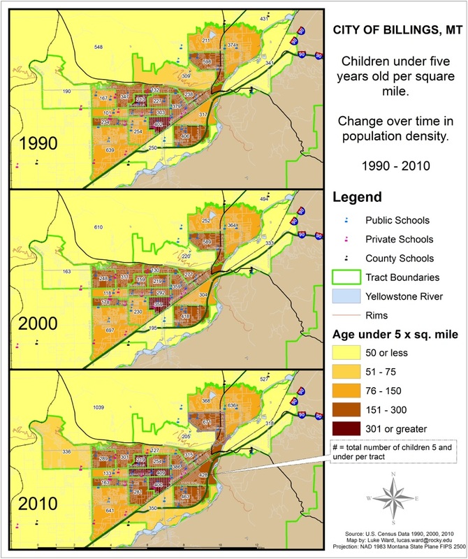
This map shows population density of 0-5 year old children by census tract and includes the exact number of children in each tract. While polygon (census tract area) size affects population per square mile measures, the display of actual numbers can minimize distortion by including the actual number of students (see legend, #) A more precise analysis can be created using geocoded student location.
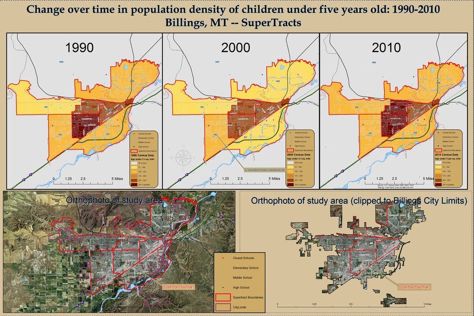
Supertract* Maps like this one, allow the viewer to compare changes in larger boundary areas over time.
| Click for a Larger View - Supertracts * |
*Super Tracts
Note: The census bureau adjusts the boundaries of census tracts periodically as population changes. In some parts of Billings, this results in actual tract boundaries shifting significantly over the course of the three decades (the focus of the above maps). For these reasons, the boundaries (red) & and associated data in the orthophoto maps should be thought of as 'super tracts'. Super tracts were created by merging tracts where boundaries shifted between 1990 and 2010 into larger boundaries. This effectively controls for census bureau adjustments and permits viewers to quickly compare change in population density of children under five in seven core areas without having to consider the problem of changing census tract boundaries.
Note: The census bureau adjusts the boundaries of census tracts periodically as population changes. In some parts of Billings, this results in actual tract boundaries shifting significantly over the course of the three decades (the focus of the above maps). For these reasons, the boundaries (red) & and associated data in the orthophoto maps should be thought of as 'super tracts'. Super tracts were created by merging tracts where boundaries shifted between 1990 and 2010 into larger boundaries. This effectively controls for census bureau adjustments and permits viewers to quickly compare change in population density of children under five in seven core areas without having to consider the problem of changing census tract boundaries.